Color Printing
Blue printing on earthenware began as Staffordshire's answer to the demands for an inexpensive alternative to Chinese porcelain. Cobalt blue was one of the few mineral colors that would withstand the heat of a glaze firing and could therefore be applied before the glaze and was protected by the finished glassy surface. The limited palette of colors that could be used in this way included black and brown. But alongside the technical qualities, the pleasing aesthetics of cobalt blue ensured it remained by far the most popular color even after the discovery of chromium and the introduction of underglaze greens and pinks.
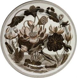
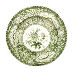
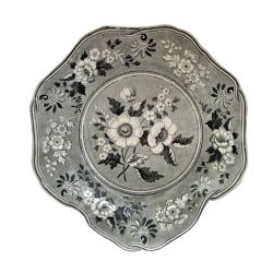
Spode introduced chrome green underglaze printing in about 1822 where it was a popular color for floral prints. By 1832, shortly before the Spode family relinquished the business, an underglaze pink was prepared by adding a small amount of chrome added to tin oxide, Spode-marked pink prints are not common. A pale black known as Payne's grey remained popular for a short time in the 1830s. It was also in the 1830s that brown resurfaced as a popular print color, particularly in the American market.
 Water Lily pattern, printed in brown, introduced by Wedgwood in 1808 |  Design from Spode's Floral Series printed in green |  Design from Spode's Botanical Series printed in Payne's grey |
